
[인공지능] 케라스 기초 - MNIST 예제를 통해 모델 구성하기
- 카테고리 없음
- 2022. 2. 16. 17:06

참조
- https://www.youtube.com/watch?v=mzOpojTpliA&list=PL7ZVZgsnLwEHGS6EId3B_AnRYSCi_35rj&index=3
- https://trendy00develope.tistory.com/42
MNIST 데이터란?
- MNIST 데이터란 필기 숫자의 분류를 위한 학습 데이터의 집합입니다.
- 즉, 이 데이터는 어지럽게 필기된 숫자가 어떤 숫자에 해당하는지 정확하게 맞추기 위한 학습을 위한 것입니다.
MNIST 예제 모델 구성하기
모듈 불러오기
import tensorflow as tf
from tensorflow.keras.datasets.mnist import load_data
from tensorflow.keras.models import Sequential
from tensorflow.keras import models
from tensorflow.keras.layers import Dense, Input, Flatten
from tensorflow.keras.utils import to_categorical
from sklearn.model_selection import train_test_split
import numpy as np
import matplotlib.pylab as plt
plt.style.use('seaborn-white')
데이터셋 로드
- MNIST 데이터셋을 로드
- Train Data 중, 30%를 검증 데이터(validation data)로 사용
# 데이터셋 로드
tf.random.set_seed(111)

(x_train_full, y_train_full), (x_test, y_test) = load_data(path='mnist.npz')

x_train, x_val, y_train, y_val = train_test_split(x_train_full, y_train_full,
                                                  test_size = 0.3,
                                                  random_state = 111)
데이터 확인
# 데이터 확인
num_x_train = (x_train.shape[0])
num_x_val = (x_val.shape[0])
num_x_test = (x_test.shape[0])

print("학습 데이터 : {}\t레이블 : {}".format(x_train_full.shape, y_train_full.shape))
print("학습 데이터 : {}\t레이블 : {}".format(x_train.shape, y_train.shape))
print("검증 데이터 : {}\t레이블 : {}".format(x_val.shape, y_val.shape))
print("테스트 데이터 : {}\t레이블 : {}".format(x_test.shape, y_test.shape))

num_sample = 5

random_idxs = np.random.randint(6000, size = num_sample)

plt.figure(figsize=(14, 8))
for i, idx in enumerate(random_idxs):
    img = x_train_full[idx, :]
    label = y_train_full[idx]

    plt.subplot(1, len(random_idxs), i+1)
    plt.imshow(img)
    plt.title("Index: {}, Label : {}".format(idx, label))

plt.grid()
plt.show()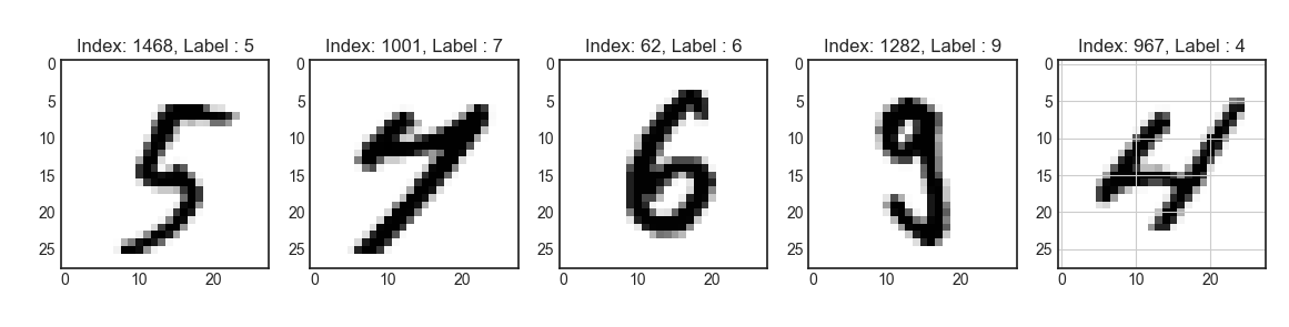
데이터 전처리
- Normalization
# 데이터 전처리
x_train = x_train / 255. # 0~255.0 사이의 값을 갖는 픽셀값들을 0~1.0 사이의 값을 갖도록 변환합니다.
x_val = x_val / 255. # 0~255.0 사이의 값을 갖는 픽셀값들을 0~1.0 사이의 값을 갖도록 변환합니다.
x_test = x_test / 255. # 0~255.0 사이의 값을 갖는 픽셀값들을 0~1.0 사이의 값을 갖도록 변환합니다.

y_train = to_categorical(y_train)
y_val = to_categorical(y_val)
y_test = to_categorical(y_test)
모델 구성(Sequential)
# 모델 구성(Sequential)
model = Sequential([Input(shape=(28,28), name='input'),
                    Flatten(input_shape=[28,28], name='flatten'),
                    Dense(100, activation='relu', name='dense1'),
                    Dense(64, activation='relu', name='dense2'),
                    Dense(32, activation='relu', name='dense3'),
                    Dense(10, activation='softmax', name='output')])

model.summary()
모델 컴파일
# 모델 컴파일
model.compile(loss='categorical_crossentropy',
              optimizer='sgd',
              metrics=['accuracy'])
모델 학습
- 모델 시각화를 위해 history라는 변수에 학습 과정을 담음
# 모델 학습
history = model.fit(x_train, y_train,
                    epochs=50,
                    batch_size=128,
                    validation_data=(x_val, y_val))
학습 결과 시각화
- 학습이 진행될 수록, loss는 줄어들고, accuracy는 증가하는것을 그래프를 통해 확인할 수 있습니다.
# 학습 결과 시각화
history.history.keys() # dictionary 형태로 이루어짐

history_dict = history.history
loss = history_dict['loss']
val_loss = history_dict['val_loss']

epochs = range(1, len(loss) + 1)
fig = plt.figure(figsize=(12, 6))

ax1 = fig.add_subplot(1, 2, 1)
ax1.plot(epochs, loss, color='blue', label='train_loss')
ax1.plot(epochs, val_loss, color='red', label='val_loss')
ax1.set_title('Train and Validation Loss')
ax1.set_xlabel('Epochs')
ax1.set_ylabel('Loss')
ax1.grid()
ax1.legend()

accuracy = history_dict['accuracy']
val_accuracy = history_dict['val_accuracy']

ax2 = fig.add_subplot(1,2,2)
ax2.plot(epochs, accuracy, color='blue', label='train_accuracy')
ax2.plot(epochs, val_accuracy, color='red', label='val_accuracy')
ax2.set_title('Train and Validation accuracy')
ax2.set_xLabel('Epochs')
ax2.set_ylabel('Loss')
ax2.grid()
ax2.legend()

plt.show()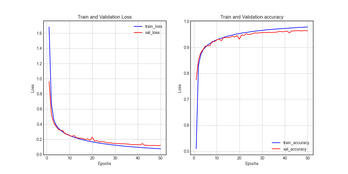
모델 평가(1)
- evaluate() 함수로 모델 평가 할 수 있습니다.
# 모델 평가
model.evaluate(x_test, y_test)
학습된 모델을 통해 값 예측
# 학습된 모델을 통해 값 예측
pred_ys = model.predict(x_test)
print(pred_ys.shape)

np.set_printoptions(precision=7)
print(pred_ys[0])

arg_pred_y = np.argmax(pred_ys, axis=1)

plt.imshow(x_test[0])
plt.title("predicted label: {}".format(arg_pred_y[0]))
plt.show()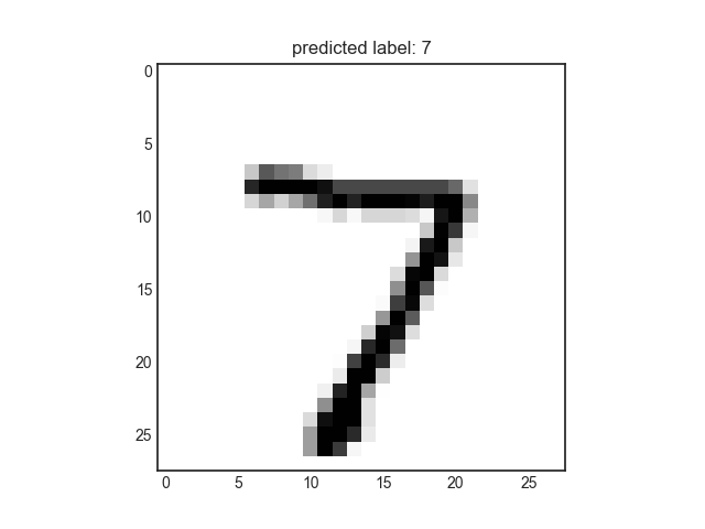
모델 평가(2)
- 혼동행렬 (Confusion Maxtrix)
# 모델 평가(2)
from sklearn.metrics import classification_report, confusion_matrix
import seaborn as sns
sns.set(style='white')

plt.figure(figsize=(8,8))
cm = confusion_matrix(np.argmax(y_test, axis=-1), np.argmax(pred_ys, axis=-1))
sns.heatmap(cm, annot=True, fmt='d', cmap='Blues')
plt.xlabel('Predicted Label')
plt.ylabel('TrueLabel')
plt.show()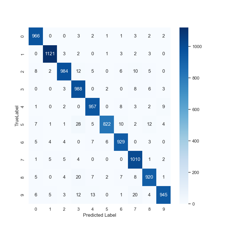
모델 평가 (3)
- 분류 보고서
# 모델 평가(3)
print(classification_report(np.argmax(y_test, axis=-1), np.argmax(pred_ys, axis=-1)))
precision recall f1-score support
0 0.97 0.99 0.98 980
1 0.98 0.99 0.99 1135
2 0.98 0.95 0.96 1032
3 0.93 0.98 0.95 1010
4 0.96 0.97 0.97 982
5 0.99 0.92 0.95 892
6 0.96 0.97 0.97 958
7 0.95 0.98 0.96 1028
8 0.96 0.94 0.95 974
9 0.98 0.93 0.96 1009
accuracy 0.96 10000
macro avg 0.96 0.96 0.96 10000
weighted avg 0.96 0.96 0.96 10000MNIST 전체 예제 코드
from matplotlib.pyplot import annotate, axis
import tensorflow as tf
from tensorflow.keras.datasets.mnist import load_data
from tensorflow.keras.models import Sequential
from tensorflow.keras import models
from tensorflow.keras.layers import Dense, Input, Flatten
from tensorflow.keras.utils import to_categorical
from sklearn.model_selection import train_test_split
import numpy as np
import matplotlib.pylab as plt

plt.style.use('seaborn-white')

# 데이터셋 로드
tf.random.set_seed(111)

(x_train_full, y_train_full), (x_test, y_test) = load_data(path='mnist.npz')

x_train, x_val, y_train, y_val = train_test_split(x_train_full, y_train_full,
                                                  test_size = 0.3,
                                                  random_state = 111)

# 데이터 확인
num_x_train = (x_train.shape[0])
num_x_val = (x_val.shape[0])
num_x_test = (x_test.shape[0])

print("학습 데이터 : {}\t레이블 : {}".format(x_train_full.shape, y_train_full.shape))
print("학습 데이터 : {}\t레이블 : {}".format(x_train.shape, y_train.shape))
print("검증 데이터 : {}\t레이블 : {}".format(x_val.shape, y_val.shape))
print("테스트 데이터 : {}\t레이블 : {}".format(x_test.shape, y_test.shape))

num_sample = 5

random_idxs = np.random.randint(6000, size = num_sample)

plt.figure(figsize=(14, 8))
for i, idx in enumerate(random_idxs):
    img = x_train_full[idx, :]
    label = y_train_full[idx]

    plt.subplot(1, len(random_idxs), i+1)
    plt.imshow(img)
    plt.title("Index: {}, Label : {}".format(idx, label))

plt.grid()
plt.show()

# 데이터 전처리
x_train = x_train / 255.
x_val = x_val / 255.
x_test = x_test / 255.

y_train = to_categorical(y_train)
y_val = to_categorical(y_val)
y_test = to_categorical(y_test)

# 모델 구성(Sequential)
model = Sequential([Input(shape=(28,28), name='input'),
                    Flatten(input_shape=[28,28], name='flatten'),
                    Dense(100, activation='relu', name='dense1'),
                    Dense(64, activation='relu', name='dense2'),
                    Dense(32, activation='relu', name='dense3'),
                    Dense(10, activation='softmax', name='output')])

model.summary()

# 모델 컴파일
model.compile(loss='categorical_crossentropy',
              optimizer='sgd',
              metrics=['accuracy'])

# 모델 학습
history = model.fit(x_train, y_train,
                    epochs=50,
                    batch_size=128,
                    validation_data=(x_val, y_val))

# 학습 결과 시각화
history.history.keys() # dictionary 형태로 이루어짐

history_dict = history.history
loss = history_dict['loss']
val_loss = history_dict['val_loss']

epochs = range(1, len(loss) + 1)
fig = plt.figure(figsize=(12, 6))

ax1 = fig.add_subplot(1, 2, 1)
ax1.plot(epochs, loss, color='blue', label='train_loss')
ax1.plot(epochs, val_loss, color='red', label='val_loss')
ax1.set_title('Train and Validation Loss')
ax1.set_xlabel('Epochs')
ax1.set_ylabel('Loss')
ax1.grid()
ax1.legend()

accuracy = history_dict['accuracy']
val_accuracy = history_dict['val_accuracy']

ax2 = fig.add_subplot(1,2,2)
ax2.plot(epochs, accuracy, color='blue', label='train_accuracy')
ax2.plot(epochs, val_accuracy, color='red', label='val_accuracy')
ax2.set_title('Train and Validation accuracy')
ax2.set_xlabel('Epochs')
ax2.set_ylabel('Loss')
ax2.grid()
ax2.legend()

plt.show()

# 모델 평가(1)
model.evaluate(x_test, y_test)

# 학습된 모델을 통해 값 예측
pred_ys = model.predict(x_test)
print(pred_ys.shape)

np.set_printoptions(precision=7)
print(pred_ys[0])

arg_pred_y = np.argmax(pred_ys, axis=1)

plt.imshow(x_test[0])
plt.title("predicted label: {}".format(arg_pred_y[0]))
plt.show()

# 모델 평가(2)
from sklearn.metrics import classification_report, confusion_matrix
import seaborn as sns
sns.set(style='white')

plt.figure(figsize=(8,8))
cm = confusion_matrix(np.argmax(y_test, axis=-1), np.argmax(pred_ys, axis=-1))
sns.heatmap(cm, annot=True, fmt='d', cmap='Blues')
plt.xlabel('Predicted Label')
plt.ylabel('TrueLabel')
plt.show()

# 모델 평가(3)
print(classification_report(np.argmax(y_test, axis=-1), np.argmax(pred_ys, axis=-1)))
728x90